Claude Powerline
A vim-style powerline statusline for Claude Code with real-time usage tracking, git integration, and custom themes.






Installation
Requires Node.js 18+, Claude Code, and Git 2.0+. For best display, install a Nerd Font or use --charset=text for ASCII-only symbols.
Setup Wizard (Recommended)
The interactive wizard walks you through theme, style, font, segment, and budget selection.
# run inside Claude Code, one at a time
/plugin marketplace add Owloops/claude-powerline
/plugin install claude-powerline@claude-powerline
/powerline
The wizard writes ~/.claude/claude-powerline.json and updates your settings.json automatically. Run /powerline again any time to reconfigure.
Manual Setup
Add to your Claude Code settings.json:
{
  "statusLine": {
    "type": "command",
    "command": "npx -y @owloops/claude-powerline@latest --style=powerline"
  }
}
Start a Claude session and the statusline appears at the bottom. Using npx automatically downloads and runs the latest version without manual updates.
Powerline Studio
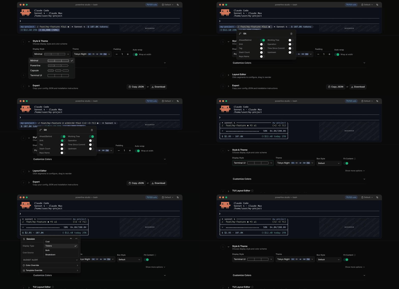
powerline.owloops.com is a visual configurator for claude-powerline. Click segments in the preview to toggle options, switch styles and themes live, reorder, then copy or download the JSON into ~/.claude/claude-powerline.json. Paste an existing config to edit it.
Styles
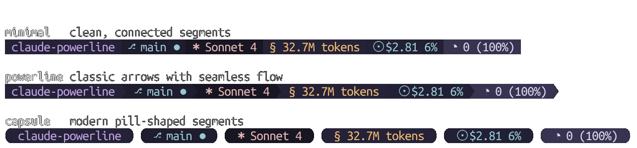
Configuration
Config locations (in priority order):
./.claude-powerline.json- Project-specific~/.claude/claude-powerline.json- User config~/.config/claude-powerline/config.json- XDG standard
Override priority: CLI flags > Environment variables > Config files > Defaults
Config files reload automatically, no restart needed.
Get example config:
curl -o ~/.claude/claude-powerline.json https://raw.githubusercontent.com/Owloops/claude-powerline/main/.claude-powerline.json
CLI Options and Environment Variables
CLI Options (both --arg value and --arg=value syntax supported):
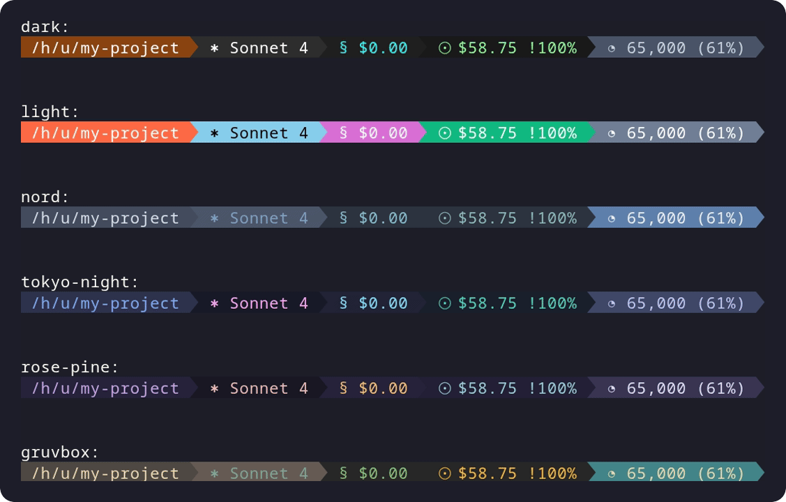
--theme-dark(default),light,nord,tokyo-night,rose-pine,gruvbox,custom--style-minimal(default),powerline,capsule,tui--charset-unicode(default),text--config- Custom config file path--help- Show help
Examples:
claude-powerline --theme=nord --style=powerline
claude-powerline --theme=dark --style=capsule --charset=text
claude-powerline --config=/path/to/config.json
Environment Variables:
export CLAUDE_POWERLINE_THEME=dark
export CLAUDE_POWERLINE_STYLE=powerline
export CLAUDE_POWERLINE_CONFIG=/path/to/config.json
export CLAUDE_POWERLINE_DEBUG=1  # Enable debug logging
Segment Configuration
Directory - Shows current working directory name
"directory": {
  "enabled": true,
  "style": "full"
}
Options:
style: Display format -full|fish|basenamefull: Show complete path (e.g.,~/projects/claude-powerline)fish: Fish-shell style abbreviation (e.g.,~/p/claude-powerline)basename: Show only folder name (e.g.,claude-powerline)
In --worktree sessions, the directory segment automatically shows the original repo path instead of the worktree folder (no config required).
Git - Shows branch, status, and repository information
"git": {
  "enabled": true,
  "showSha": true,
  "showWorkingTree": false,
  "showOperation": false,
  "showTag": false,
  "showTimeSinceCommit": false,
  "showStashCount": false,
  "showAheadBehind": true,
  "showUpstream": false,
  "showRepoName": false
}
Options:
showSha: Show abbreviated commit SHAshowWorkingTree: Show staged/unstaged/untracked countsshowOperation: Show ongoing operations (MERGE/REBASE/CHERRY-PICK)showTag: Show nearest tagshowTimeSinceCommit: Show time since last commitshowStashCount: Show stash countshowAheadBehind: Show ahead/behind arrows (defaulttrue)showUpstream: Show the upstream branch name, e.g.→origin/mainshowRepoName: Show repository nameshowWorktree: Show the worktree indicator (⧉) when the current directory belongs to a linked git worktree. Defaults to whatevershowRepoNameis, so set it explicitly to get the indicator on its own — or tofalseto suppress it while still showing the repo name
The two upstream options are independent. showUpstream controls the branch name only, showAheadBehind controls the ↑/↓ arrows. The default (showUpstream: false) already gives you arrows without the name; to drop the arrows too, set showAheadBehind: false.
Symbols:
- Unicode:
⎇Branch •♯SHA •⌂Tag •⧇Stash •✓Clean •●Dirty •⚠Conflicts •↑3Ahead •↓2Behind •⧉Worktree •(+1 ~2 ?3)Staged/Unstaged/Untracked - Text:
~Branch •#SHA •TTag •SStash •=Clean •*Dirty •!Conflicts •^3Ahead •v2Behind •WWorktree •(+1 ~2 ?3)Staged/Unstaged/Untracked
Model - Shows current Claude model being used
"model": {
  "enabled": true
}
Symbols: ✱ Model (unicode) • M Model (text)
Session - Shows real-time usage for current Claude conversation
"session": {
  "enabled": true,
  "type": "tokens",
  "costSource": "calculated"
}
Options:
type: Display format -cost|tokens|both|breakdowncostSource: Cost calculation method -calculated(ccusage-style) |official(hook data)showUnits: Show the trailingtokensunit whentypeistokensorboth(default:true). Set tofalseto render§ 4.4Minstead of§ 4.4M tokens. Only applies to the powerline/capsule/minimal styles; thetuistyle already renders tokens without a suffix
Symbols: § Session (unicode) • S Session (text)
Today - Shows total daily usage with budget monitoring
"today": {
  "enabled": true,
  "type": "both"
}
Options:
type: Display format -cost|tokens|both|breakdownshowUnits: Show the trailingtokensunit whentypeistokensorboth(default:true). Set tofalseto render☉ $12.34 (4.4M)instead of☉ $12.34 (4.4M tokens). Only applies to the powerline/capsule/minimal styles; thetuistyle already renders tokens without a suffix
Symbols: ☉ Today (unicode) • D Today (text)
Context - Shows context window usage and auto-compact threshold
"context": {
  "enabled": true,
  "showPercentageOnly": false,
  "displayStyle": "text",
  "autocompactBuffer": 33000
}
Options:
showPercentageOnly: Show only percentage remaining (default: false)displayStyle: Visual style for context display (default:"text")autocompactBuffer: Number of tokens reserved as the auto-compact trigger zone (default:33000). The usable percentage reflects how close you are to the point where compaction fires. Set to0if you have auto-compact disabled to show raw context usage insteadpercentageMode: How to display the percentage."remaining"counts down from 100% (context left),"used"counts up from 0% (context consumed). Default depends on display style:"remaining"fortext,"used"for bar styles
Display Styles:
| Style | Filled | Empty | Example |
|---|---|---|---|
text | -- | -- | ◔ 34,040 (79%) |
ball | ─ | ─ | ─────●──── 50% |
bar | ▓ | ░ | ▓▓▓▓▓░░░░░ 50% |
blocks | █ | ░ | █████░░░░░ 50% |
blocks-line | █ | ─ | █████───── 50% |
capped | ━ | ┄ | ━━━━╸┄┄┄┄┄ 50% |
dots | ● | ○ | ●●●●●○○○○○ 50% |
filled | ■ | □ | ■■■■■□□□□□ 50% |
geometric | ▰ | ▱ | ▰▰▰▰▰▱▱▱▱▱ 50% |
line | ━ | ┄ | ━━━━━┄┄┄┄┄ 50% |
squares | ◼ | ◻ | ◼◼◼◼◼◻◻◻◻◻ 50% |
Symbols: ◔ Context (unicode) • C Context (text)
Model Context Limits
Configure context window limits for different model types. Defaults to 200K tokens for all models.
"modelContextLimits": {
  "sonnet": 1000000,
  "opus": 200000
}
Available Model Types:
sonnet: Claude Sonnet models (3.5, 4, etc.)opus: Claude Opus modelsdefault: Fallback for unrecognized models (200K)
Note: Sonnet 4's 1M context window is currently in beta for tier 4+ users. Set "sonnet": 1000000 when you have access.
Block - Shows usage within current 5-hour billing window (Claude's rate limit period)
"block": {
  "enabled": true,
  "displayStyle": "text"
}
Options:
displayStyle: Visual style for utilization display (see table below)
Requires Claude Code's native rate_limits hook data (Claude.ai Pro/Max subscribers). Displays the official 5-hour utilization percentage and reset countdown. Hidden when native data is unavailable.
Display Styles:
| Style | Example |
|---|---|
text (default) | ◱ 23% (4h 12m) |
bar | ◱ ▪▪▫▫▫▫▫▫▫▫ 23% (4h 12m) |
blocks | ◱ ██░░░░░░░░ 23% (4h 12m) |
blocks-line | ◱ ██──────── 23% (4h 12m) |
capped | ◱ ━╸┄┄┄┄┄┄┄┄ 23% (4h 12m) |
dots | ◱ ●●○○○○○○○○ 23% (4h 12m) |
filled | ◱ ■■□□□□□□□□ 23% (4h 12m) |
geometric | ◱ ▰▰▱▱▱▱▱▱▱▱ 23% (4h 12m) |
line | ◱ ━━┄┄┄┄┄┄┄┄ 23% (4h 12m) |
squares | ◱ ◼◼◻◻◻◻◻◻◻◻ 23% (4h 12m) |
ball | ◱ ──●─────── 23% (4h 12m) |
Symbols: ◱ Block (unicode) • B Block (text)
Weekly - Shows usage within 7-day rolling rate limit window
"weekly": {
  "enabled": true,
  "displayStyle": "text"
}
Options:
displayStyle: Visual style for utilization display - same options as the block segment (see table above)
Only visible when Claude Code provides native rate_limits.seven_day data (Claude.ai Pro/Max subscribers). Hidden when the data is not available.
Symbols: ◑ Weekly (unicode) • W Weekly (text)
Metrics - Shows performance analytics from your Claude sessions
"metrics": {
  "enabled": true,
  "showResponseTime": true,
  "showLastResponseTime": false,
  "showDuration": true,
  "showMessageCount": true,
  "showLinesAdded": true,
  "showLinesRemoved": true
}
Options:
showResponseTime: Total API duration across all requestsshowLastResponseTime: Individual response time for most recent queryshowDuration: Total session durationshowMessageCount: Number of user messages sentshowLinesAdded: Lines of code added during sessionshowLinesRemoved: Lines of code removed during session
Symbols:
- Unicode:
⧖Total API time •ΔLast response •⧗Session duration •⟐Messages •+Lines added •-Lines removed - Text:
RTotal API time •LLast response •TSession duration •#Messages •+Lines added •-Lines removed
Version - Shows Claude Code version
"version": {
  "enabled": true
}
Display: v1.0.81
Symbols: ◈ Version (unicode) • V Version (text)
Agent - Shows active subagent name when Claude Code is invoked with --agent (hidden otherwise)
"agent": {
  "enabled": true,
  "showLabel": false
}
Display: ◇ researcher (or ◇ agent: researcher with showLabel: true)
Symbols: ◇ Agent (unicode) • & Agent (text)
Thinking - Shows extended-thinking on/off state and/or reasoning effort level when provided by Claude Code
"thinking": {
  "enabled": true,
  "showEnabled": true,
  "showEffort": true
}
Set showEnabled: false to hide the On/Off state, or showEffort: false to hide the effort level. If both are true the two parts are joined with ·; if only one is shown, no separator is rendered.
Display: ✦ On · xhigh (both shown) • ✦ On (enabled only) • ✦ xhigh (effort only)
Symbols: ✦ Thinking (unicode) • T Thinking (text)
Output Style - Shows the active Claude Code output style (default, Explanatory, Learning, or a custom style)
Opt-in (enabled: false by default).
"outputStyle": {
  "enabled": true,
  "showLabel": false,
  "hideDefault": false
}
Set showLabel: true to prefix the name with style: . Set hideDefault: true to omit the segment while the active style is default (compared case-insensitively), so the segment only appears once you switch away from the default style.
Display: ✎ Explanatory (or ✎ style: Explanatory with showLabel: true)
Symbols: ✎ Output Style (unicode) • OS Output Style (text)
The style name comes from Claude Code on stdin and is rendered verbatim. Older Claude Code builds do not send it — the segment is then hidden entirely rather than rendered empty.
Cache Timer - Shows time since last turn, tracking Claude's 5-minute prompt cache TTL
Opt-in (enabled: false by default).
"cacheTimer": {
  "enabled": true
}
Display: ◴ 3:42 (m:ss under 5m) • ◴ 17m (5–59m) • ◴ 1h+ (1 hour or more)
Color tiers: healthy green (0–3m) → yellow warn (3–5m) → red critical (5m+). Hidden when transcript_path is unavailable.
Anchor: elapsed time is measured from the last user message in the transcript (matches Anthropic's cache TTL anchor), falling back to the transcript file mtime if JSONL parsing fails.
Display modes: displayMode: "elapsed" (default) shows time-since-last-turn as above. displayMode: "remaining" flips it to a countdown of the cache TTL — useful when you care about how long until cold rather than how stale (matches the Codex CLI status line):
"cacheTimer": {
  "enabled": true,
  "displayMode": "remaining"
}
In remaining mode the display reads ◴ 59:51 while warm and ◴ cold once expired; color tiers invert (warn under 5m left, critical under 1m left or cold).
TTL detection: the segment auto-detects which cache window Claude Code is using by reading the last assistant message's usage.cache_creation block. ephemeral_1h_input_tokens > 0 ⇒ 1h TTL; ephemeral_5m_input_tokens > 0 ⇒ 5-minute TTL. Falls back to 3600 if no usage data is available yet (e.g. the very first turn). Set ttlSeconds explicitly to override:
"cacheTimer": { "enabled": true, "displayMode": "remaining", "ttlSeconds": 300 }
TUI: also available in grid templates via {cacheTimer}, {cacheTimer.icon}, and {cacheTimer.value}.
Symbols: ◴ Cache timer (unicode) • C! Cache timer (text)
Note:
cacheTimeronly updates when Claude Code re-runs the statusline. SetrefreshIntervalin your Claude Code~/.claude/settings.jsonstatusLineblock so the elapsed time ticks while you're idle — otherwise the timer freezes between events:{ "statusLine": { "type": "command", "command": "npx -y @owloops/claude-powerline@latest", "refreshInterval": 10 } }
refreshIntervalis in seconds (min 1).10keeps the displayed value within ~10s of reality.
Tmux - Shows tmux session name and window info when in tmux
"tmux": {
  "enabled": true
}
Display: tmux:session-name
Session ID - Shows the current Claude session identifier
"sessionId": {
  "enabled": false,
  "showIdLabel": true
}
Options:
showIdLabel: Show the⌗icon prefix before the session ID (default:true)
Display: ⌗ a1b2c3d4-...
Symbols: ⌗ Session ID (unicode) • # Session ID (text)
Env - Shows the value of an environment variable
"env": {
  "enabled": true,
  "variable": "CLAUDE_ACCOUNT",
  "prefix": "Acct"
}
Options:
variable(required): Environment variable name to readprefix: Label shown before the value. Defaults to the variable name
Hidden when the variable is unset or empty.
Symbols: ⚙ Env (unicode) • $ Env (text)
Advanced Configuration
Budget Configuration
"budget": {
  "session": { "amount": 10.0, "warningThreshold": 80 },
  "today": { "amount": 25.0, "warningThreshold": 80 },
  "block": { "amount": 15.0, "type": "cost", "warningThreshold": 80 }
}
Options:
amount: Budget limit (required for percentage display)type: Budget type -cost(USD) |tokens(for token-based limits)warningThreshold: Warning threshold percentage (default: 80)showPercentage: Show theN%suffix (default:true)showValue: Show the base cost/token value (default:true)
Indicators: 25% Normal • +75% Moderate (50-79%) • !85% Warning (80%+)
Display toggles. For session and today, you can hide the percentage suffix, the base value, or both:
"budget": {
  "today": { "amount": 50, "showPercentage": false }
}
showPercentage: falsehides theN%suffix while keeping the budget configured (e.g. for warning thresholds).showValue: falserenders only the percentage (e.g.◱ 15%).- Both
falsehides the segment entirely.
A visible effect requires amount > 0 AND a computable percentage (e.g. when type: "tokens", tokens must be present). Without a budget or a computable percentage, these flags are no-ops and the segment falls back to rendering the base value. block accepts the same fields for config symmetry but does not render a budget suffix today, so they have no visible effect there.
[!TIP] Claude's rate limits consider multiple factors beyond tokens (message count, length, attachments, model). See Anthropic's usage documentation for details.
Character Sets
Choose between Unicode symbols (requires Nerd Font) or ASCII text mode for maximum compatibility.
{
  "display": {
    "charset": "unicode"
  }
}
Options:
unicode(default) - Uses Nerd Font icons and symbolstext- ASCII-only characters for terminals without Nerd Font
The charset setting works independently from separator styles, giving you 8 possible combinations:
minimal+unicode/text- No separatorspowerline+unicode/text- Arrow separators (requires Nerd Font for unicode)capsule+unicode/text- Rounded caps (requires Nerd Font for unicode)tui+unicode/text- Bordered panel with rounded or ASCII box characters
Layout: Auto-Wrap, Multi-line, and Padding
Auto-Wrap (enabled by default):
{
  "display": {
    "autoWrap": true
  }
}
Segments flow naturally and wrap to new lines when they exceed the terminal width.
Multi-line Layout for manual control:
{
  "display": {
    "lines": [
      {
        "segments": {
          "directory": { "enabled": true },
          "git": { "enabled": true },
          "model": { "enabled": true }
        }
      },
      {
        "segments": {
          "session": { "enabled": true },
          "today": { "enabled": true },
          "context": { "enabled": true }
        }
      }
    ]
  }
}
Padding - number of spaces on each side of segment text:
{
  "display": {
    "padding": 1
  }
}
Set to 0 for compact, 1 (default) for standard spacing.
Show Icons - hide the leading emblem on each segment for a text-only look:
{
  "display": {
    "showIcons": false
  }
}
Default true. Per-segment override via showIcon on any segment (e.g. "git": { "enabled": true, "showIcon": true }) takes precedence. Status glyphs (git ● ✓ ⚠, ahead/behind arrows), powerline separators, and metrics sub-icons are unaffected.
[!NOTE] Claude Code system messages may truncate long status lines. Use
autoWrapor manual multi-line layouts to prevent segment cutoff.
Colors and Custom Themes
Create custom themes and configure color compatibility:
{
  "theme": "custom",
  "display": {
    "colorCompatibility": "auto"
  },
  "colors": {
    "custom": {
      "directory": { "bg": "#ff6600", "fg": "#ffffff" },
      "git": { "bg": "#0066cc", "fg": "#ffffff" },
      "session": { "bg": "#cc0099", "fg": "#ffffff" }
    }
  }
}
Color Options: bg (hex, transparent, none) • fg (hex) • bold (boolean, optional, defaults to false)
TUI Grid Colors: In TUI grid mode, custom colors also support bare segment names and dot-notation parts as keys. A bare segment key (e.g. "context") sets the default color for the segment and all its parts. A part key (e.g. "context.bar") overrides a specific part:
"colors": {
  "custom": {
    "model": { "fg": "#e0d68a" },
    "context": { "fg": "#7dcfff" },
    "metrics.lastResponse": { "fg": "#bb9af7" }
  }
}
Compatibility Modes: auto (default), ansi, ansi256, truecolor
Environment Variables:
NO_COLOR- Disable all colors when set to any non-empty value (follows NO_COLOR standard)FORCE_COLOR- Force enable color output (follows FORCE_COLOR standard):0orfalse- Disable colors1ortrue- Force basic 16 colors (ANSI)2- Force 256 colors3- Force truecolor (16 million colors)- Any other non-empty value - Force basic colors
COLORTERM- Auto-detected for truecolor support
Priority: FORCE_COLOR overrides NO_COLOR (allowing color to be forced on even when NO_COLOR is set)
TUI Panel Mode
{
  "statusLine": {
    "type": "command",
    "command": "npx -y @owloops/claude-powerline@latest --style=tui"
  }
}
By default, the TUI panel uses a built-in responsive layout. For full control over what goes where, add a display.tui object to your config. This activates the grid layout engine, a CSS Grid-inspired system that lets you define rows, columns, spans, and responsive breakpoints.
Grid Layout Configuration
Add display.tui to your config file to enable the grid engine:
{
  "display": {
    "style": "tui",
    "tui": {
      "fitContent": true,
      "widthReserve": 45,
      "minWidth": 32,
      "maxWidth": 120,
      "padding": { "horizontal": 4 },
      "separator": {
        "column": "  ",
        "divider": "─"
      },
      "box": { ... },
      "title": { ... },
      "footer": { ... },
      "segments": { ... },
      "breakpoints": [ ... ]
    }
  }
}
| Property | Type | Default | Description |
|---|---|---|---|
fitContent | boolean | false | Panel shrinks to fit content instead of filling terminal width |
widthReserve | number | 45 | Characters reserved from terminal width (ignored when fitContent: true) |
minWidth | number | 32 | Minimum panel width |
maxWidth | number | ∞ | Maximum panel width |
padding.horizontal | number | 0 | Extra horizontal padding in fitContent mode |
separator.column | string | " " | String placed between columns |
separator.divider | string | box char | Character used for --- divider rows |
box | object | -- | Custom box-drawing characters (see below) |
title | object | -- | Title bar text configuration (see below) |
footer | object | -- | Footer text configuration (see below) |
segments | object | -- | Custom segment templates (see below) |
breakpoints | array | required | Responsive layout definitions |
Breakpoints
Each breakpoint defines a complete layout that activates when the panel width is at or above its minWidth. The engine picks the first match, sorted widest-first.
"breakpoints": [
  {
    "minWidth": 80,
    "areas": [
      "git.head      git.head     git.head     .               git.working",
      "---",
      "context.icon  context.bar  context.bar  context.pct     context.tokens",
      "block.icon    block.bar    block.bar    block.value     block.time"
    ],
    "columns": ["auto", "1fr", "auto", "auto", "auto"],
    "align": ["left", "left", "right", "right", "right"]
  },
  {
    "minWidth": 55,
    "areas": [
      "git.head             git.working",
      "---",
      "context.bar          context.tokens",
      "block                ."
    ],
    "columns": ["1fr", "auto"],
    "align": ["left", "right"]
  },
  {
    "minWidth": 0,
    "areas": [
      "git.head",
      "git.working",
      "---",
      "context",
      "block"
    ],
    "columns": ["1fr"],
    "align": ["left"]
  }
]
| Property | Type | Required | Description |
|---|---|---|---|
minWidth | number | yes | Minimum panel width to activate this layout |
areas | string[] | yes | Grid rows, each string is one row of space-separated cell names |
columns | string[] | yes | Column sizing: "auto", "1fr" / "2fr", or a fixed number like "20" |
align | string[] | no | Per-column alignment: "left", "center", or "right" (defaults to "left") |
Column sizing:
"auto"- shrinks to the widest content in that column"1fr","2fr"- fractional units that divide remaining space proportionally"20"- fixed width in characters
Special area tokens:
.- empty cell (renders as blank space)---- full-width horizontal divider row
Spanning: repeat the same name in adjacent cells to span columns:
"context.bar context.bar context.bar context.pct context.tokens"
Here context.bar spans the first three columns.
Segment Names
Use bare segment names to render the full pre-formatted segment:
context  block    session  today    weekly
git      dir      model    version  tmux
metrics  activity env      agent    thinking
cacheTimer  outputStyle
Dot-Notation Subsegments
Use segment.part to place individual pieces of a segment into separate cells with independent alignment:
| Segment | Parts |
|---|---|
session | icon, label, cost, tokens, budget |
block | icon, label, value, time, budget, bar |
today | icon, cost, label, budget |
weekly | icon, label, pct, time, bar |
git | icon, headVal, branch, status, ahead, behind, working, worktree, head |
context | icon, label, bar, pct, tokens |
metrics | response, responseIcon, responseVal, lastResponse, lastResponseIcon, lastResponseVal, added, addedIcon, addedVal, removed, removedIcon, removedVal |
activity | icon, duration, durationIcon, durationVal, messages, messagesIcon, messagesVal |
model | icon, value |
version | icon, value |
tmux | label, value |
dir | icon, value |
env | prefix, value |
agent | icon, name |
thinking | icon, enabled, effort |
cacheTimer | icon, value |
outputStyle | icon, name |
Example, block segment with a progress bar, mirroring the context layout:
"areas": [
  "context.icon  context.bar  context.bar  context.pct  context.tokens",
  "block.icon    block.bar    block.bar    block.value  block.time"
]
[!NOTE]
context.bar,block.bar, andweekly.barare width-aware. Their progress bars render at exactly the resolved column width. Block bar usesnativeUtilizationfrom the 5-hour rate limit data. Weekly bar uses the 7-dayused_percentage.
Custom Box Characters
Override individual box-drawing characters. Partial overrides merge with the charset default (unicode or text):
"box": {
  "topLeft": "┌",
  "topRight": "┐",
  "bottomLeft": "└",
  "bottomRight": "┘",
  "horizontal": "─",
  "vertical": "│",
  "teeLeft": "├",
  "teeRight": "┤"
}
Only specify the characters you want to change. The rest inherit from the active charset.
Title Bar
Configure the left and right text in the top border. Supports {model} and any {segment} or {segment.part} token that resolves from segment data:
"title": {
  "left": "{model}",
  "right": "{dir}"
}
| Property | Type | Default | Description |
|---|---|---|---|
left | string | "{model}" | Left-side text (supports tokens) |
right | string | false | "claude-powerline" | Right-side text, or false to hide |
Footer
Same as the title bar, but on the bottom border. Defaults to no text (plain border):
"footer": {
  "left": "{weekly}",
  "right": "{metrics.lastResponse}"
}
| Property | Type | Default | Description |
|---|---|---|---|
left | string | -- | Left-side footer text (supports tokens) |
right | string | -- | Right-side footer text (supports tokens) |
Tokens resolve any segment or subsegment reference: {model}, {dir}, {git.head}, {block.value}, {metrics.lastResponse}, etc.
Segment Templates
Define custom compositions for composite cells using the segments key. This assembles multiple parts into a single cell:
"segments": {
  "metrics.lastResponse": {
    "items": ["{lastResponseIcon}", "{lastResponseVal}"],
    "gap": 1,
    "justify": "start"
  }
}
| Property | Type | Default | Description |
|---|---|---|---|
items | string[] | required | Part references like "{partName}" or literal strings |
gap | number | 1 | Spaces between items |
justify | string | "start" | "start" packs items left; "between" distributes across cell width |
The template name (e.g. metrics.lastResponse) can then be used as a cell name in areas.
Automatic Culling
Empty segments are automatically removed. Cells resolve to ., empty rows are dropped, and orphaned dividers are cleaned up. A wide layout gracefully degrades when data is unavailable.
[!NOTE] Claude Code's internal progress indicators (spinner, context bar) may briefly overlap the TUI panel during tool calls. This is a limitation of the hook architecture and resolves once the tool call completes.
Custom Segments (Shell Composition)
Extend the statusline using shell composition:
{
  "statusLine": {
    "type": "command",
    "command": "npx -y @owloops/claude-powerline && echo \" $(date +%H:%M)\"",
    "padding": 0
  }
}
[!NOTE] Use
tputfor colors:setab <bg>(background),setaf <fg>(foreground),sgr0(reset). Example:echo "$(tput setab 4)$(tput setaf 15) text $(tput sgr0)". For complex logic, create a shell script with multiple commands, conditions, and variables.
Contributing
Contributions are welcome! Please feel free to submit issues or pull requests.
See CONTRIBUTORS.md for people who have contributed outside of GitHub PRs.
License
This project is licensed under the MIT License.